Why Mobile-Friendly Websites are Essential for Michigan Nonprofits and Small Businesses
Discover why a mobile-responsive website is crucial for reaching your audience in Michigan, how to check your site's compatibility, and what to look for in a web design partner.
The Mobile Imperative for Local Organizations
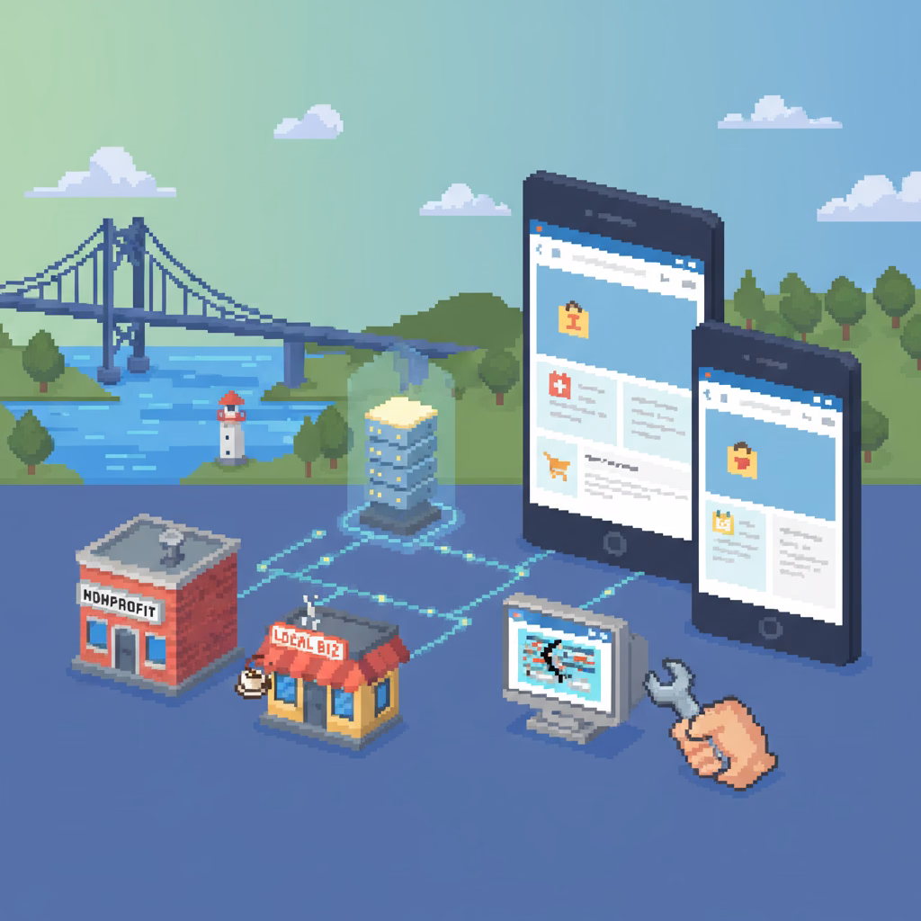
In today's digital landscape, a significant portion of your audience in Michigan is accessing information on the go. For nonprofits and small businesses, having a website that looks and functions flawlessly on smartphones and tablets isn't just a nice-to-have—it's a necessity. Whether you're a nonprofit seeking donations and volunteers or a small business aiming to attract local customers, a mobile-friendly site ensures your message reaches everyone, everywhere. At Advanced WEB Strategies, we understand this critical need and specialize in creating websites that are compatible with all devices, ensuring your web presence is strong and accessible.
Why Mobile Responsiveness Boosts Your Reach
Think about how often you use your phone to browse the internet, find local services, or check out an organization. Your potential supporters and customers are doing the same. A non-mobile-friendly site leads to frustration: tiny text, awkward navigation, and slow loading times. This poor experience can drive visitors away, hurting your engagement, conversions, and even your search engine rankings. Google prioritizes mobile-friendly sites, meaning a responsive design can significantly improve your visibility in local search results and help more people in Rochester Hills and beyond discover your mission or services.
Key Characteristics of a Mobile-Friendly Website
So, what exactly makes a website mobile-friendly? It's primarily about responsive design, which means your site automatically adjusts its layout, images, and text to fit any screen size. Beyond responsiveness, a great mobile experience includes fast loading speeds, easy-to-tap buttons and links, readable font sizes without needing to zoom, and streamlined navigation. The goal is to provide a seamless and intuitive experience for every user, regardless of the device they're using, making it easy for them to learn about your cause, make a purchase, or get in touch.
How to Assess Your Current Website's Mobile Performance
Unsure if your website is up to par? There are simple ways to check. The most straightforward method is to visit your site on various devices—your smartphone, a tablet, and even different browsers. Pay attention to how quickly it loads, if you need to pinch and zoom to read text, and if buttons are easy to click. You can also use Google's free Mobile-Friendly Test tool, which provides a quick analysis and suggestions for improvement. Understanding your site's current state is the first step toward enhancing your online presence.
Partnering with the Right Web Design Expert
When it comes to optimizing or building a mobile-friendly website, choosing the right partner is crucial. You need a web designer who not only understands the technical aspects of responsive design but also listens to your specific needs and goals. Many clients have shared their positive experiences working with us, highlighting our patient and collaborative approach. For instance, one client praised our team's patience and ability to create a phenomenal website, noting our accommodating nature for upgrades and changes. This kind of dedicated support ensures your website evolves with your organization and technology.
Beyond Design: SEO and User Experience Benefits
A mobile-friendly website isn't just about aesthetics; it's a powerful tool for your overall digital strategy. Improved mobile experience leads to lower bounce rates and higher engagement, signaling to search engines that your site is valuable. This, in turn, can boost your search engine optimization (SEO) efforts, helping your nonprofit or small business rank higher in search results, especially for local queries. By providing a clean, fast, and accessible site, you enhance user experience, build trust, and ultimately achieve your organizational objectives more effectively.
Your Local Partner for a Stronger Web Presence
At Advanced WEB Strategies, located in Rochester Hills, MI, we are dedicated to helping local nonprofits and small businesses thrive online. We utilize the latest technology to deliver clean, fast development for websites that are compatible with tablets and smartphones. Our goal is to create a professional web presence for a reasonable price, allowing you to focus on what you do best. We believe that every organization deserves a website that performs excellently across all devices, ensuring maximum reach and impact within our community and beyond.
Ready to Enhance Your Mobile Presence?
If your website isn't delivering the seamless mobile experience your audience expects, it might be time for an upgrade. A modern, responsive design can significantly improve your online visibility, engagement, and ultimately, your success. Don't let an outdated website hold your mission or business back. Contact Advanced WEB Strategies today for a consultation. We're here to help you create a powerful, mobile-friendly web presence that truly represents your organization and connects with your audience.
Customer review
Article by
Advanced WEB Strategies
Our goal is to help non-profits and small businesses create a professional website for a reasonable price. We want to create your web presence, so you can focus on what you do best. We utilize the latest technology with clean, fast development. We create websites that are compatible with tablets and smartphones.